Restaurants Exist Outside Downtown

Downtown restaurants (and downtown, in general) is not doing well. I think we all know that. Office vacancies are way up (and continuing to rise), parking is getting ever more expensive, the homeless situation is little improved, construction (of state buildings) is ongoing and, of course, restaurants are closing.

I understand the city is in a tough spot. Prior councils spent and committed too lavishly and this budget hole has been looming for years and parking revenue is an easy lever to pull. Construction is annoying, but when done, these new buildings should help support both tourism and more desirable work environs. The homeless situation has proven intractable for most cities and of the options available and we certainly do not want to force the homeless into more residential neighborhoods.

Which brings us to something that has moved into Sacramento’s neighborhoods. Something I would submit is not an entirely undesirable trend.

Delicious food from Mulvaney's in Midtown.

Downtown restaurants have struggled, there is no question. By the end of 2024, spending at downtown restaurants (defined as those in the 95814 zip code) had just recovered to the levels they were at in 2019Q4, prior to COVID-19’s onset. This is before accounting for inflation. In real terms, spending remains down by 23% over that period.

Delicious food from Bodega in the Pocket-Greenhaven neighborhood.

But, despite the numerous doom and gloom headlines focusing on closures, restaurant spending in Sacramento is actually up. Since 2019 Q4, restaurant spending across Sacramento has grown by 28% (~4% after inflation). The other central city neighborhoods are doing fine, up 26% (~2% after inflation). But the real stars are … everywhere else. Our friends and neighbors took the slogan “Dine Local” very seriously. The neighborhoods were we live are, increasingly, where we are choosing to dine as well. In the rest of Sacramento, restaurant spending is up 43% (~16% after inflation). That is a headline we should be celebrating. Our neighborhood restaurants, overall, are doing pretty well.

A line chart showing indexed restaurant spending in California, highlighting Citywide (1.28), 95811 (1.26), 95816 (1.25), and 95814 (1.00)

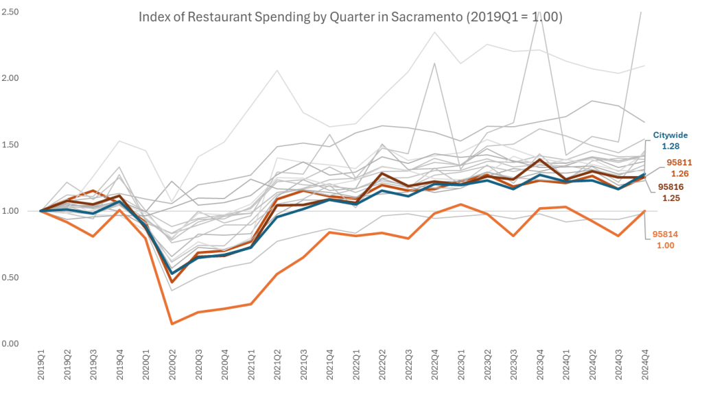
Sacramento has always been celebrated as a “city of neighborhoods” and essentially all of our neighborhoods have seen real growth. Oak Park (95817) restaurant spending has more than doubled. Meadowview (95832) spending is up 67%. Natomas (95833, 95834, 95835, 95838) spending is up 63%. East Sac (95819) is up 54%. Land Park (95818,95822) is up 39%. My beloved Pocket neighborhood (95831) is up 35%.

Delicious food from Revolution Wines in the Midtown neighborhood.

Downtown is important and the city should continue to find ways to make our central city a place where people want to be, a place people want to visit, a place people want to dine, a place people want to play, and yes, a place people want to work. But forcing people to leave their families, spend their time in traffic, their money on parking (and childcare), and their sanity on the unfortunate state of downtown’s current reality is not going to help downtown’s image and it’s not going to generate good will, good vibes, or extra cash to spend on non-necessities. Non-necessities like dining out, whether downtown or in our neighborhoods.

If we squeeze our workers, we will squeeze our restaurants too, both the ones that are struggling and the ones that are succeeding in today’s new normal.

Delicious food from Cacio in the Pocket-Greenhaven neighborhood.

Data provided by the City of Sacramento, with my thanks.

Hella yummy food beckons at New Helvetia Brewing, new home to Jim Denny's on Broadway

Sacramento Needs a New Flag

flag-header

Sacramento, I love you. But it’s time we had a frank discussion about our flag.

It’s… well, ugly.

Behold:

current-flag-jpg

Sacramento’s flag reminds me of that type of inoffensive abstract art that is the go-to for corporate hallways. There is a lot to dislike here, from the lack of symmetry, the odd blobs in the corners, the unappealing color palette (and two different shades of blues?), to the Rorschach test of what’s being depicted.

And it’s not just me who hates our flag. The world does. In 2004, the North American Vexillological Association conducted an internet beauty pageant asking the public to grade the municipal flags of America’s 150 biggest cities. Sacramento’s scored a 4.97 out of 10. Not the worst of the bunch – get it together, Pocatello – but it’s still a failing grade.

Which is too bad, because a city’s flag can be a source of civic pride. If you go to Oakland, for example, you will see the city’s official logo – an Oak tree – everywhere. People actually tattoo the city’s tree on their arms. Like the Kings logo does for basketball fans, a city flag can help rally and unite its citizens and become a part of that city’s identity. But for a municipal flag to go from obscurity to mainstream it needs be appealing, instantly recognizable, and easily reproducible.

Sacramento’s flag is none of those things. But the good news is that while Sacramento is California’s oldest city, her flag is one of the state’s newest, and we have not shied away from rebranding in the past…

Meet the New Flag…

The history of our current flag dates back to 1989. In honor of Sacramento’s 150-year anniversary, the city council appropriated $25,000 for city celebrations, including $5,000 “for the design and fabrication of a new City Flag.” A team of five volunteer artists from the Art Directors and Artists Club of Sacramento set to the task, generating four options for council consideration. After nine months of design, public review, and debate, our city’s new banner was finally unveiled by Mayor Anne Rudin at the Radisson Hotel to top off the Sesquicentennial celebration.

flagoptions

The four contenders.

As one flag expert delicately put it, Sacramento’s flag has a distinctly “modernistic design.” Or, as one internet wag put it, “Sacramento… what the f— is going on there?”

What is going on there, for those interested, is a potent bouillabaisse of symbolism. To wit:

“White represents the city’s virtue, strength, and bright future. The two blue sections represent the city’s rivers (the Sacramento and the American), green stands for the agricultural heritage, and the gold color represents the gold miners so important in the history of California and of Sacramento, the center of the Gold Country and the 1849 Gold Rush.”

…Better than the Old Flag.

But, as ugly as the present city flag is, it is orders of magnitude better than the third grade art project that was its predecessor. Behold again:

sacramento-old-flag-jpg

Much like its clip art, the old flag has a colorful history. By 1964, Sacramento was one of the last major cities without an official flag. This gave E. A. Combatalade, the enterprising founder of the Sacramento Camellia Festival Association, a grand idea. He approached the city council about adopting an official flag to mark the city’s 125-year anniversary. (Sound familiar?) They agreed. Working with a flag manufacturer and an assistant editor at the Sacramento Bee, he designed a flag steeped in Sacramento’s 19th century heritage:

“Centered at the hoist is the C. P. Huntington locomotive, in profile toward the fly, commemorating Sacramento as the terminus of the nation’s first transcontinental railroad. … Centered at the fly is a Pony Express rider on horseback, headed at full gallop toward the hoist, marking Sacramento’s role as the western terminus of the Pony Express. … In the lower center … is the state capitol dome, denoting Sacramento as the state’s capital. … [A]bove the dome is a bearded miner, kneeling by a stream, panning for gold, and symbolizing the discovery of gold in California.”

And what flower adorns the base of the capitol dome? Combatalade’s beloved Camellia – Sacramento’s official flower.

Can there be a good flag?

It turns out there is no law that municipal flags have to be unattractive. There’s actually an excellent TED talk on how to Make Local Flags Great Again.™ And, in fact, the good people at the Vexillogical Association have distilled down the designing of a smart local flag to five key principles:

  1. Keep it simple.
  2. Use meaningful symbolism.
  3. Use two to three basic colors.
  4. No lettering or seals of any kind.
  5. Be distinctive.

Consider, for example, four city flags that beautifully illustrate these design principles:

goodflags

These are simple but memorable designs, using bold colors, that tell a story of what each city is about. The fleurs-de-lis on New Orleans’ flag is a nod to that city’s French heritage; Denver’s flag nestles the city below the Rocky Mountains; Chicago’s blue strips represents the two branches of the Chicago river and each star a major episode in the city’s history; and Phoenix … has a phoenix.

Third Time’s the Charm

The last two flags were adopted to celebrate Sacramento’s 125-year (1964) and 150-year (1989) anniversaries. Unfortunately, Sacramento’s 175-year anniversary (2014) has already passed – but that does not mean we should wait until the 200th to commission a new flag.

Sacramento in 2017 is a city undergoing a renaissance. The arts, culinary, and sports scenes are booming; downtown is metamorphosing into a landmark destination; and residents from all corners of the map are excited to live in and claim the city. Even outsiders are recognizing that – gasp!Sacramento is cool.

Let’s seize this electric moment, and give Sacramentans a banner to finally match our pride in our city.