

Sacramento, I love you. But it’s time we had a frank discussion about our flag.
It’s… well, ugly.
Behold:

Sacramento’s flag reminds me of that type of inoffensive abstract art that is the go-to for corporate hallways. There is a lot to dislike here, from the lack of symmetry, the odd blobs in the corners, the unappealing color palette (and two different shades of blues?), to the Rorschach test of what’s being depicted.
And it’s not just me who hates our flag. The world does. In 2004, the North American Vexillological Association conducted an internet beauty pageant asking the public to grade the municipal flags of America’s 150 biggest cities. Sacramento’s scored a 4.97 out of 10. Not the worst of the bunch – get it together, Pocatello – but it’s still a failing grade.
Which is too bad, because a city’s flag can be a source of civic pride. If you go to Oakland, for example, you will see the city’s official logo – an Oak tree – everywhere. People actually tattoo the city’s tree on their arms. Like the Kings logo does for basketball fans, a city flag can help rally and unite its citizens and become a part of that city’s identity. But for a municipal flag to go from obscurity to mainstream it needs be appealing, instantly recognizable, and easily reproducible.
Sacramento’s flag is none of those things. But the good news is that while Sacramento is California’s oldest city, her flag is one of the state’s newest, and we have not shied away from rebranding in the past…
Meet the New Flag…
The history of our current flag dates back to 1989. In honor of Sacramento’s 150-year anniversary, the city council appropriated $25,000 for city celebrations, including $5,000 “for the design and fabrication of a new City Flag.” A team of five volunteer artists from the Art Directors and Artists Club of Sacramento set to the task, generating four options for council consideration. After nine months of design, public review, and debate, our city’s new banner was finally unveiled by Mayor Anne Rudin at the Radisson Hotel to top off the Sesquicentennial celebration.

The four contenders.
As one flag expert delicately put it, Sacramento’s flag has a distinctly “modernistic design.” Or, as one internet wag put it, “Sacramento… what the f— is going on there?”
What is going on there, for those interested, is a potent bouillabaisse of symbolism. To wit:
“White represents the city’s virtue, strength, and bright future. The two blue sections represent the city’s rivers (the Sacramento and the American), green stands for the agricultural heritage, and the gold color represents the gold miners so important in the history of California and of Sacramento, the center of the Gold Country and the 1849 Gold Rush.”
…Better than the Old Flag.
But, as ugly as the present city flag is, it is orders of magnitude better than the third grade art project that was its predecessor. Behold again:
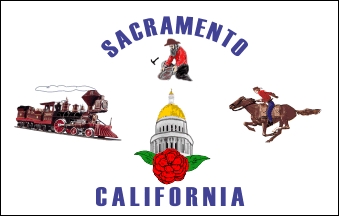
Much like its clip art, the old flag has a colorful history. By 1964, Sacramento was one of the last major cities without an official flag. This gave E. A. Combatalade, the enterprising founder of the Sacramento Camellia Festival Association, a grand idea. He approached the city council about adopting an official flag to mark the city’s 125-year anniversary. (Sound familiar?) They agreed. Working with a flag manufacturer and an assistant editor at the Sacramento Bee, he designed a flag steeped in Sacramento’s 19th century heritage:
“Centered at the hoist is the C. P. Huntington locomotive, in profile toward the fly, commemorating Sacramento as the terminus of the nation’s first transcontinental railroad. … Centered at the fly is a Pony Express rider on horseback, headed at full gallop toward the hoist, marking Sacramento’s role as the western terminus of the Pony Express. … In the lower center … is the state capitol dome, denoting Sacramento as the state’s capital. … [A]bove the dome is a bearded miner, kneeling by a stream, panning for gold, and symbolizing the discovery of gold in California.”
And what flower adorns the base of the capitol dome? Combatalade’s beloved Camellia – Sacramento’s official flower.
Can there be a good flag?
It turns out there is no law that municipal flags have to be unattractive. There’s actually an excellent TED talk on how to Make Local Flags Great Again.™ And, in fact, the good people at the Vexillogical Association have distilled down the designing of a smart local flag to five key principles:
- Keep it simple.
- Use meaningful symbolism.
- Use two to three basic colors.
- No lettering or seals of any kind.
- Be distinctive.
Consider, for example, four city flags that beautifully illustrate these design principles:

These are simple but memorable designs, using bold colors, that tell a story of what each city is about. The fleurs-de-lis on New Orleans’ flag is a nod to that city’s French heritage; Denver’s flag nestles the city below the Rocky Mountains; Chicago’s blue strips represents the two branches of the Chicago river and each star a major episode in the city’s history; and Phoenix … has a phoenix.
Third Time’s the Charm
The last two flags were adopted to celebrate Sacramento’s 125-year (1964) and 150-year (1989) anniversaries. Unfortunately, Sacramento’s 175-year anniversary (2014) has already passed – but that does not mean we should wait until the 200th to commission a new flag.
Sacramento in 2017 is a city undergoing a renaissance. The arts, culinary, and sports scenes are booming; downtown is metamorphosing into a landmark destination; and residents from all corners of the map are excited to live in and claim the city. Even outsiders are recognizing that – gasp! – Sacramento is cool.
Let’s seize this electric moment, and give Sacramentans a banner to finally match our pride in our city.

Nick, I’m digging this up. Post budget I want to engage in this.
LikeLike
[…] the post that probably ruffled the most moustaches. Responding to my call for Sacramento to pick a new official flag, 10% of you furiously typed “outrageous!” while the other 90% of you scratched your heads and […]
LikeLike
[…] (represented by a Kings flag, both because the current flag needs replacing and because the data represents the metropolitan area, not just the city) was hit hard by the […]
LikeLike
Are there others with a (C)?
LikeLike
So when’s Sacramento going to open up a contest for a new flag?
LikeLike
Not a US flag, so I did not include it in the post, but my favorite municipal flag hands down is Hong Kong’s: https://en.wikipedia.org/wiki/Flag_of_Hong_Kong#/media/File:Flag_of_Hong_Kong.svg.
LikeLike
Fun fact: The original Chicago flag only had two stars.
That’s kind of depressing. I guess all that had ever happened there was a big fire and a fair.
LikeLiked by 1 person
If you haven’t clicked on Pocatello’s flag, you need to. I believe it is the only flag in the U.S. with a trademark (TM) symbol! (http://flag.pocatello.us/img/pocatello-flag.jpg) They actually recently started a commission to replace their flag — there is hope for Sacramento!
LikeLike